When to use floats and when to use doubles is one of those classic topics of discussion and much less pointless than the code formatting religious fights. A fun thing in the new edition of FCG is that Steve Marschner and I are in opposite camps. I just checked what amazon previews to the reader with "look inside" and found this (note-- I think that discussion of debugging is something I wish I could send back in time to myself-- it's VERY basic but graphics debugging is different in some ways):
Screen capture from Amazon preview of Fundamentals of Computer Graphics 4th edition
The newest edition of my intro graphics book is done early. It looks like the kindle edition is out and the hardcopy will at at amazon soon. I just got my copies in the mail today! I am a big fan of this edition. It is also now Marschner and Shirley et al., instead of Shirley and Marchner et al. Any great improvements in the book I am pretending are correlation and not causation. But being second author is like I hear being a grandparent is-- all the benefit and none of the responsibility. Please report any problems to Steve.
This edition we have moved to color:
That retro image in the bottom right is there for nostalia's sake. It was my first good image (1988 I think). It was 1024x768 and took two weeks to do radiosity and light maps and 16 viewing rays per pixel on a VAX 11-780. It was my first "real" C++ program (I think). Modeled in vi (for real) and some hand rolled rotate a piece-wise linear curve code. Here it is in all its low-res noisy glory.
I recently noticed that a paper of mine from a few years ago had zero references. This wasn't a paper with any deep research but instead was a "what is the simplest algorithm we can do that works" paper. The idea was what to do with the practical problem of how most tone mapping pipelines kill bright blues. Here is a figure from the paper on our inspiration for the user-controlled "dial" we added:
I think I figured out why nobody uses this paper-- we never put a copy online! I just fixed that. The paper is:
A copy is available near the bottom of my papers page.
Summary: Overall, the whiteboarding alone is reason enough for
me to buy an iPad pro-- it has gone over that magic threshold of "good
enough" that pads of paper will be a thing of the past for me. Your excuse may be different (pencil drawing is a good one), so I think this device will be huge.
Dave Hart and Grue Debry got an iPad Pro with stylus for their company and they loaned it to me to try out tonight. I used their limnu shared whiteboarding program to test it.
I tried it with the math I was messing with today (trying to meet Andrew Glassner's color space challenge to get uniformity into the prismatic color volume).
First, I **love** that I can rest my hand on the iPad while I draw (the iPad pro understands not to count that as a touch).
My hand is resting on the iPad as I draw and this is more important to my comfort than I would have thought
My biggest reaction was that this iPad is exactly the size I want. It's about the size of 8.5 by 11 paper (actual working area size about 7 3/4" by 10 1/4"), so maybe that size evolved in paper to be the "right size" or maybe I am just so used to it that I like it. Any bigger and it would be awkward to transport, and using this as a pad in a coffee shop is a great use case. And of course you can pan so really it's a window into a much bigger sheet of paper.
The stylus is fantastic. It feels good and has some features that has me not as eye-rolling about calling it a pencil.
As a white board marker I loved it. Changing colors and nib sizes was more useful than I anticipated. Using it as an eraser (which I had to do a lot as will be evident in some of the not very careful eases below-- I really do use limnu like a white board-- it's for blazing through ideas). Here's my first screenful.
A screenshot of my first session on limnu with the iPad Pro
15 more 2x2 equations to solve (doing them as special cases to take advantage of zero dropouts) so I will definitely need the pan feature. I used to use a big real white board or a giant artist pad for these situations, but I will most definitely use a tablet from now on. Even without the saving and collaboration features I think it would be a win just because of physical portability and fluidity.
Overall, the whiteboarding alone is reason enough for me to buy an iPad pro-- it has gone over that magic threshold of "good enough" that pads of paper will be a thing of the past for me. I don't think it will make my laptop obsolete due to OS issues (Microsoft is making a better play for that now). But the hardware of the iPad pro is in the laptop power zone. John Gruber has a really interesting discussion of this hardware/software issue.
I had an interesting discussion with Andrew Glassner (since this is often a ray tracing blog I'll tell the youngsters that Andrew is known for many things but he's also the inventor of the first sub-linear ray intersection algorithm!) about the prismatic color model I have been touting. Andrew points out that while it retains the good properties of HSV it also retains its worst property: terrible color uniformity. The color scientists have long rightly held that it would be nice if a color space had intuitively similar changes in color for similar changes in distance in the space. The so-called MacAdam ellipses on the CIE diagram (where each ellipse holds a collection of colors that are nearby) can be used to warp the CIE space to a more uniform one.
Each MacAdam Ellipse has a set of colors you can barely tell are different. A "uniform" color space would have disks of the same size for these. Source wiikipedia.
Andrew rightly points out that for a color space to be kick-ass (my term) it should be at least somewhat uniform. So a challenge to all of you out there: create a uniform space that is RGB-centric. Or if you know of one, tell me!
SnapChat has gotten a lot of bad press for its privacy policy lately. It is likely overblown, but our Pando app (download links here) not only has a great privacy policy, we can't see your photos if we wanted to (we don't have the keys).
I am working on a fishtank VR demo. I have been looking at various engines and APIs and so far none of them have a very general camera model. Most give me the ability to hardwire the viewing matrices, but I figure that if I do that maybe I should just use GLUT-- I don't want the disadvantages of a high level framework unless I also avoid low-level programming.
Here is a nice discussion of this for game engines. Note it may be out of date but a really nice paper. Since I am doing mono fishtank VR, this paper calls that "head couple motion" which I think is a term I will adopt-- it's very descriptive. What I need in the camera is the ability to shear off the center of the screen (perhaps a lot), e.g.:
This is straightforward (if easy to mess up) to do with projection and other matrices. Three.js does allow this functionality but only indirectly using a tile of screens analogy.
So what I want is one of two things:
A simple GL or similar sample program that does this for some cool model or even just an environment map
A high level toolkit that supports this naturally
If it has tracking from a camera bonus, but not essential.
I am working on a "Fishtank VR" prototype and asked around and a lot of people told me Three.js is the easiest API for 3D prototyping. So last night I dug into learn it (and found and watched some of this cool udacity course from Eric Haines on graphics using Three.js as a vehicle for much of it). I just started using it and dealing with the camera API is where I need to invest some classic graphics API wrangling. Whenever you want to do something "weird" with a camera, that is where some pain will lie.
What I want for fishtank VR is ideally an API that allows me to specify viewpoint in some physical units (like meters), and the location of the physical rectangle of the screen is real physical units (like the position of one corner and the vectors of bottom and side). Most camera APIs do not have this directly, so the question is can you get at them indirectly, or do you have to make your own from scratch.
The most general camera in Three.js is the perspective camera. This method is what I will need to use if this is to work:
This appears to be when you have a wall of tiled screens. But happily the API designer made it a little more general. All I need to do is manage the relative position of the eye and the "portal", So I think this can be made to work.
If we assume red, yellow, and neutral as our primaries this means we want to restrict our hues to this triangle:
There are lots of ways to project hues to that triangle, with this one being better at projecting greens to yellows which is less disruptive in practice:
The Zorn palette is usually used when there is no blue (like a sky) but let's do it out of its comfort zone for fun:
Suppose you want to move a color C to white. In the prismatic space you do this in the hue cross section. The most direct way is just to add the barycenric of white and subtract the barycentric of C. That works, but will make some hues move out of the triangle. For that the simplest method is to clamp and renormalize. I searched for "tungsten" at flickr and found a yellow photo. This one is clearly on purpose, but still a good example.
Now we can apply a shift to all hues:
The code for this shift/clamp/renormalize (with a vec3 C++ class) is:
The (22,18,10) was just one tenth of the 8 bit RGB color of the back wall. The one tenth is to allow me to do arithmetic in my head.
An hue C is on some line between a neutral hue N and the most saturated (pure) one P on the triangle boundary. The saturation is the fraction of the distance along the line (0 for neutral, 1 on the boundary, about 0.25 for the example below):
The lines of constant saturation are just inscribed triangles:
These are also just isolines of the smallest barycentric coordinate, which will always vary from 1/3 at N to 0 on the boundary. This suggests the saturation s is:
s = 1 - 3*min(rho, beta, gamma)
The pure color P is just at s = 1, and the color C can be expressed:
C = N + s(P-N)
Thus
P = N + (C - N)/s
Now that we know P, we can change s to a new value s' and apply the formula
Note: this model has taken over all of my code. We decided we should share it. I love it! Try it!
In our Subjective photo processing iPhone app (please buy it and rate it!), we have to manipulate color in all the classic ways (and a few others). For example, increase saturation. I was very dissatisfied with all the color models commonly used in graphics.
One candidate was some general space like the CIE diagram. But like many applications we have an RGB space that starts and ends in RGB, so a simple gamut is good. The classic one is a cylinder of some kind such as HSV :
The practical problems with these spaces for my purposes are 1) intermediate colors such as yellow are not along a line from two colors that make them (red and green), and 2) computationally getting to and from the RGB cube is not that simple.
I hired Dave Hart as a consultant (who with Grue DeBry has founded a cool company Limnu developing collaborative white boards) to help my find the right space. Dave really liked this barycentic space for the hue part. Turns out this hue space is often used in computer vision because it factors out illumination and is good for getting a crude albedo transform. Here's a figure with that space on the right from a paper draft Dave and I may submit someday:
The barycentric Maxwell space has the nice linearity properties of the also barycentric CIE space. The good news is barycentrics are something graphics people are comfortable with. They coordinates map nicely to the intuition of RGB mixing:
Here neutral is (1/3, 1/3, 1/3). Red is (1, 0, 0). The greek letters we use for the barycentrics are (rho, gamma, beta). A basic issue is what do we use for the lightness channel. For example, HSL and HSV above have different ideas. We go with the HSV approach so that pure colors have a lightness of 1.0. There are endless debates on this, and we like the pure colors are "light" approach because the computation and intuition are nice, and because lightness is a hard concept anyway once things get colorful as I discuss in a previous post.
The computation for getting to and from this space is awesomely simple (and KISS is good!!!):
I will post some of the ways I use it in a later post.
We've just updated our main iPhone photo editing app, Subjective, to include reworks of our most successful filters. It uses a new color space we've developed that I will post more on later this week.
We'll be updating the UI to our new design, but the basic flow and the filters we provide will stay the same.
Please go buy or update the app for $2.99 and RATE IT. I'll buy you a beer when show me the app on any phone :) This is what I am up against, so I need your help.
I want to do a simple diagram that I could easy do with SGI IRIS Showcase (my all time favorite drawing package that as far as I know is extinct). One feature it had was you could assign three colors to the three triangle vertices and it would interpolate a between the vertices (Gouraud interpolation, barycentric interpolation, linear interpolation, whatever you want to call it). As far as I know, no current programs support this. PLEASE tell me I am wrong, or go write it :)
I have been using shirley@cs.utah.edu (where I worked 7 years ago!) for some time because of the good graphics history karma of the name, the department has been kind enough to leave my account there, and because the systems support at that department is outstanding. And because my gmail idea sucks-- I can barely spell my middle name! My computer went into the shop for a week so I've been taking care of some of those non-urgent things on my to-do list and one of them is finding a more permanent email address. Gmail is the default pick for most people and I like it myself but almost every account name I have tried is taken.
I dug deep into my naming history, and recall that an old FORTRAN trick to keep to 8 letters (a requirement on some systems!) was to eliminate vowels. English has almost no information in the vowels so this works pretty well. In my name is "y" a vowel? I say yes, because it does allow one available email. Thus my new "permanent" email is now:
Unlike the ghost of Steve Jobs, I am super-excited about the new huge iPad with pencil (or "stylus" for English speakers). There are surely plenty of art apps that will be great on this device, but for me the killer app will be white-boarding. At NVIDIA I used shared white boards a lot and my far-seeing boss had me try a wacom cyntiq.
It was awkward because of clunky software (not wacom's-- the shared whiteboarding software), but wacom had the hardware nailed. It was a good enough experience I felt like I saw the future. I have been using the new shared whiteboarding app from limnu and really like it-- I use it to take quick notes on my phone when I am without a pencil. But my finger is big, and the phone is small. This shows how much I can get using that:
It's very usable on the iPad mini (I have posted those on the blog before) and I far prefer it to a "real" drawing program when just messing with ideas. I have been hoping the Windows 8 tablets would take off because their
hardware is great (and so is Windows 8 on mobile-- I loved my windows
phone! I am still wondering why it didn't). But the new iPad and stylus will make this app perfect for me! The size is something like we see in real portable whiteboards like this 8.5" by 11" one. And it looks like the Apple stylus will give finer control than most real white board markers.
It's cool that there is still hardware that can invented that I can hardly wait for!
In my previous post I did some gamma conversions to sRGB and a comment asked if I used the real sRGB gamma. I did not. From wikipedia the full formula is:
The linear part is only near the beginning (I think to avoid the infinite slope at 0). I usually just use gamma = 1/2.2 as an approximation, but I thought I better check how much error that introduces. For the part far from zero, the error is very small:
Nearer zero it's worse but as long as your range isn't in there gamma 1/2.2 is good enough for most things
Graphics people are pretty used to converting RGB colors to "luminance", and usually things that have higher luminance look brighter. For sRGB the standard formula is:
Y = 0.2126 R + 0.7152 G + 0.0722 B
The (R,G,B) here is linear. To get it linear you need a gamma of approximately 2.2 (see the wikipedia page for the exact transform which is linear for low values).
If we go with a linear Y of 0.0722, these pure saturated colors are all the same luminance:
(0, 0, 1.0)
(0, 0.1, 0)
(0.34, 0, 0)
In 8bit RGB after gamma these would be equal Y RGB:
(77, 77, 77)
(0, 0, 255)
(0, 90, 0)
(156, 0, 0)
This is an image with those colors:
Note the blue and red probably look brighter to you even through they "should" be the same luminance. The green is about the same brightness as the grey for me on my computer. There are many places in calibration and cross-computer image viewing that would explain some of why these are not all the same subjective brightness. But a contributing effect is almost certainly the Helmholtz-Kohlrausch effect, where saturated colors appear brighter than neutral colors. It's good to be aware of this because it can make you think your math is wrong when in fact your perceptual system is just complicated!
Also Eric notes: Folklore 1: Jim Blinn confirmed that the teapot model was shrunk down
because it looked nicer that way, not that the pixels were non-square
(incorrectly propagated here and here). Jim & 3D printed teapot. (I have also spread that false info! We will know computer graphics has gone mainstream when this is at snopes).
This post I am really writing mainly for myself. I can't afford to test my software with a real HDR screen like this 4000 cd/m^2 (luminace) SIM2 display which is around $30k. Mike Herf suggested I try a projector aimed at a wall to create an image about the size of the SIM2. Good idea!
I have always found photometry (light for humans) and radiometry (light for physics) confusing. For rendering you can just use radiance and once you forget its definition it doesn't impact your programming much. But when my confusion always becomes most deadly to me is when I buy a projector because the constants matter a lot there. Fortunately, I don't have to do that very often. First lets start with lumens. This is a measure of how much light comes from a light source per solid angle. When you see a projector, it usually says what it cranks out in lumens. For example, here is a screen shot from amazon today:
So it's "brightness" is 800 lumens. Ignore the term "brightness"-- that has so many inconsistent formal and informal meanings it's not useful. But the 800 lumens is objective. But what is a "lumen"? It's the "perceivable" amount of power the projector puts out. So you plug the projector in and it consumes, say, 500 Watts of power. Some of that is lost to heat and perhaps other waste, and 300 Watts comes out as photons. If that light is all ultraviolet and you can't see it, that is zero lumens. Lumens are just a constant "of human usefulness" that is wavelength dependent times the number of Watts. A very nice figure shows this:
The 683 lm/W is an historical constant to ensure backward compatibility with old units when this stuff was all candles. So our made-up 500W projector could in principle produce 683x500 lumens. This of course is the peak value of the projector. For a hypothetical laser-based projector, cranking up the green would be the brightest but for most projectors it just means a white screen.
But we are graphics people. We want luminance. So how "bright" (note the almost meaningless term but I don't have a better one!) is it? For emitting screens like phones and TVs, this can be complicated because the luminance varies with angle as visualized in this image:
This falloff is usually by design so that most of the light can be sent toward the user looking straight at the device. Not suprisingly this is especially true of mobile devices which rarely have more than one viewer. Mike Herf tells me that his measurements usually have a falloff roughly modeled by a phong-like cosine function with an exponent around 4 to 5. So when phones or TVs report their luminance they usually mean straight on viewing.
It makes sense for a projector to talk about lumens and not luminance because the luminance depends on the screen distance. What's the conversion? It depends on the screen because the screen will absorb some light, and it will vary with angle like the phone screens in the picture above.
Let's assume a perfect Lambertian screen with albedo 1.0 where all the light hits the screen. Because it's Lambertian it will be dimmer at normal viewing incidence than many screens. The measure of luminance is candela per square meter per steradian. This is sometimes called nits. If the screen is A square meters this is almost easy because of the candela per square meter part. But what's up with that steradian? As a Lambertian surface this screen will vary in how much power it send in each direction, but we know the luminance is constant so something detail-oriented and confusing is at work. So we could go dig into the first principles (my favorite is Pat Hanrahan's chapter in the Ray Tracing classic book) or we could recall a lovely formula used all the time in radiosity (for radiometry) also applies in photometry (it's all just scaling factors):
Luminance of a diffuse surface = (exiting luminous power) / (PI * area)
So for a lambertian surface, our life is simple. Take the lumens of the projector, and divide by PI times area. For a one meter screen that is approximately divide by 3. I once lived in Indiana, so I will say that is exact.
What is the area of that SIM2 screen I want to be able to emulate? It's a 47" screen, and that usually means the diagonal. It's 16x9, so the screen dimensions are approximately 41" by 23"which means it is about 943 square inches which according to a web calculator is about 0.6 square meters. Since I want to be conservative, I can call that 1.0, but also pretend my screen is perfectly white. So to get a SIM2 brightness (4000nit) at a SIM2 size I need to 12,000 lumen projector. If I can paint my wall to 90% albedo and use the real 0.6 area and the real 3.14(etc) PI, I need about an 8500lumen projector. It's hard to find relatively low-cost projectors (like $1000ish) over 5000 lumens, so this is not a happy number. But close enough that I should shop.
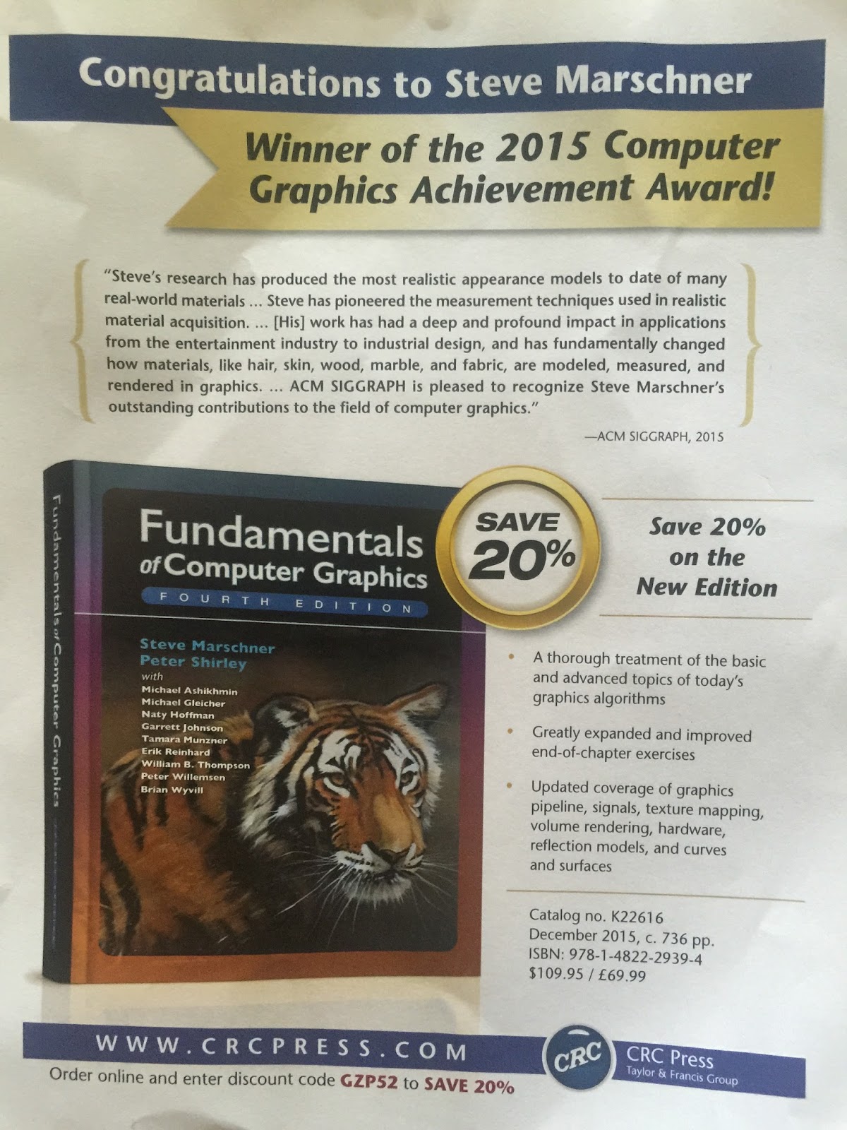
At SIGGRAPH my publisher announced the new edition of my graphics text is coming out. Here is my picture of their discount flyer:
Note a key change is Steve Marschner will now be the lead author. This is something we have been moving toward starting with the last edition. In the second edition I added some guest chapters and Steve's on signal processing was fantastic. I think one of my strengths is explaining things, but Steve is better. Steve agreed to start improving some of the core material, and we agreed that when the book was more than half his we would switch positions. He has made a ton of improvements in this edition. Just so nobody will accuse me of false modesty, I think my chapters on transformations and linear algebra are my best work and I wish I could send them back in time 30 years to my younger, hairier, slimmer, smarter, but more ignorant self. Steve has put his touch on those too, so I would send the new versions :)
But then the hunt went cold. Until last month, when Casey Mann,
Jennifer McLoud and David Von Derau of the University of Washington
Bothell announced last week that they had discovered this little beauty:
Illustration: Casey Mann
“We discovered the tile using using a computer to exhaustively search
through a large but finite set of possibilities,” said Casey. “We were
of course very excited and a bit surprised to find the new type of
pentagon.
When I tried to do a slightly more careful Brewster's angle test last week it quickly became apparent my reflectances were wrong. After a long painful bug hunt, it turns out that I had the polarization components (parallel and perpendicular) reversed the the Fresnel code. This is probably the most painful bit of code if you are used to using the Schlick approximation (which I am), so it's not surprising it was the culprit.
In the image below there are still lots of not so subtle differences. I'll do some more physical tests after siggraph because they may mainly be however the iphone is tone mapping combined with my lack of positional/geometric calibration.
Rendering on left and photo on right. Note the very dim reflection of the iPad because the camera is near Brewster's angle.
Many programmers have advocated disabling copy and paste because the resulting errors can be so painful. That indeed was the source of this lack of total internal reflection in the little cube from an earlier post:
The photo on the left has a strong internal reflection at the bottom of the cube
I tracked a bunch of rays and it turned out the total internal reflection was occurring, but the polarization transformed wrong. This code:
r_s = 1-r_s; r_p = 1-r_s;
Should have been
r_s = 1-r_s; r_p = 1-r_p;
Such typos are often so deadly because they take things in range (0-1 in this case) and keep them in range. Fixing this at least has hit that most glaring problem (the sphere looks a bit better too):
Now that I have polarization orientation on the iPad right I did another crude experiment.
Left: photo, Right:rendering
There is one glaring difference: the reflection at the bottom of the cube the ball is sitting on. It looks like total internal reflection in the photo and definitely not in the rendering. Could be uncareful position calibration and could be refractive index error in the input. Or of course bug in the renderer. Looks like to go further I will need to do a very careful scene setup, and use a camera that has raw output (sadly the iPhone doesn't as far as I know).
Question: what is the best BRDF model for materials such as glossy paint? My first impulse is to go use the Disney model, but I bet there is something specific for architectural materials that is used in practice these days?
Yesterday's picture had specular reflections that were way off. I tried a bunch of tests on my Fresnel equations and they seemed ok. I tried Brewster's Angle for the glass and this found one big problem: my model! Note that with LCD screens, no polarizers are needed to see Brewster's angle in action! Here's two photographs of the iPad at Brewster's Angle:
The ipad produces almost perfectly polarized light, and at Brewster's Angle only one of the polarizations is reflected. By rotating the iPad you can change the polarization of the incident light 90 degrees.
It occurred to me that maybe I just had the polarization 90 degrees wrong in my input model. That definitely is one of my problems! So more complete testing tomorrow.
Rendered images. Left: my incorrect input with polarization exactly wrong. Right: fixed model. Not exactly at Brewster's angle so some reflection is visible.
As can be seen on the left (photo), LCD screens like on this iPad 1 are fully linearly polarized. The big black disk is a linear polarizer rotated 90 degrees from the screen. My first attempt at a serious polarized rendering has some obvious problems! Could be the polarization infrastructure is wrong. Or the Fresnel Equations. Or both :) I'll start by trying Brewster's angle tests tomorrow.
I wasn't sure my sphere was simple glass and from what I see on the web it could be anywhere from refractive index 1.5 to 1.7. I did a reasonably measured scene to just match it visually (the lighting doesn't matter just the ray bending) and got:
Index is around 1.55. I don't think more resolution is likely with this method
Nick P suggested I use a laser pointer and that would have been easier and more accurate. Wish I read that first :) I'll try it on the glass sheet.
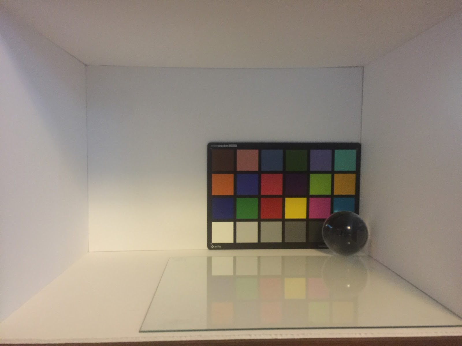
I just set up a small environment, bought a macbeth color checker, and a glass ball (amazon). No light source setup (just a white background), no camera calibration, no refractive index estimation.
Real scene, photographed with iPhone 6+, random room illumination


 This edition we have moved to color:
 That retro image in the bottom right is there for nostalia's sake. It was my first good image (1988 I think). It was 1024x768 and took two weeks to do radiosity and light maps and 16 viewing rays per pixel on a VAX 11-780. It was my first "real" C++ program (I think). Modeled in vi (for real) and some hand rolled rotate a piece-wise linear curve code. Here it is in all its low-res noisy glory.


 I think I figured out why nobody uses this paper-- we never put a copy online! I just fixed that. The paper is:
 A copy is available near the bottom of my papers page.


 This is straightforward (if easy to mess up) to do with projection and other matrices. Three.js does allow this functionality but only indirectly using a tile of screens analogy.


 There are lots of ways to project hues to that triangle, with this one being better at projecting greens to yellows which is less disruptive in practice:
 The Zorn palette is usually used when there is no blue (like a sky) but let's do it out of its comfort zone for fun:


 The lines of constant saturation are just inscribed triangles:
 These are also just isolines of the smallest barycentric coordinate, which will always vary from 1/3 at N to 0 on the boundary. This suggests the saturation s is:


 The barycentric Maxwell space has the nice linearity properties of the also barycentric CIE space. The good news is barycentrics are something graphics people are comfortable with. They coordinates map nicely to the intuition of RGB mixing:
 Here neutral is (1/3, 1/3, 1/3). Red is (1, 0, 0). The greek letters we use for the barycentrics are (rho, gamma, beta). A basic issue is what do we use for the lightness channel. For example, HSL and HSV above have different ideas. We go with the HSV approach so that pure colors have a lightness of 1.0. There are endless debates on this, and we like the pure colors are "light" approach because the computation and intuition are nice, and because lightness is a hard concept anyway once things get colorful as I discuss in a previous post.
 I will post some of the ways I use it in a later post.